Age bar graph
plotAge.Rd(Discouraged function. Please use plotBarGrouped() instead.)
Arguments
- .data
dataframe containing the variables to plot
- xvar
character string, name of the variable to plot on the x-axis in quotes (default
"XLabel")- yvar
character string, name of the variable to plot on the y-axis in quotes (default
"YValue")- fill_color1
character string, hexadecimal colour to use in the graph; (default to ECDC green
"#65B32E", see EcdcColors(col_scale = "qual", n = 1))- ytitle
character string, y-axis title; (default
"Rate").
Details
This function draws a bar graph by age group (or possibly other grouping).
The bar graph presents the distribution of cases at EU/EEA level
using the rate per 100 000 cases by age.
Expects aggregated data.
See also
Global function: getAgeGender
Internal function: EcdcColors
Required Packages: ggplot
Examples
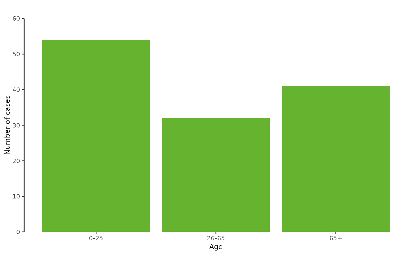
# --- Create dummy data
mydat <- data.frame(AgeGroup = c("0-25", "26-65", "65+"),
                    NumberOfCases = c(54,32,41))

# --- Plot the dummy data
plotAge(mydat,
        xvar = "AgeGroup",
        yvar = "NumberOfCases",
        ytitle = "Number of cases")