Bar graph
plotBar.RdThis function draws a bar graph of the values of variable 'Yvar'
with the categorical variable 'Xvar' on the x-axis.
Expects aggregated data.
Usage
plotBar(
  .data,
  xvar = "XLabel",
  xlabel = "",
  yvar = "YValue",
  ylabel = "",
  fill_color = EcdcColors(col_scale = "qual", n = 1)
)
Arguments
- .data
dataframe containing the variables to plot
- xvar
character string, name of the variable to plot on the x-axis in quotes (default
"XLabel")- xlabel
character string, label of the x axis
- yvar
character string, name of the variable to plot on the y-axis in quotes (default
"YValue")- ylabel
character string, label of the y axis
- fill_color
character string, hexadecimal colour to use in the graph; (default to ECDC green
"#65B32E", see EcdcColors(col_scale = "qual", n = 1))
See also
Global function: getAgeGender
Internal function: EcdcColors
Required Packages: ggplot
Examples
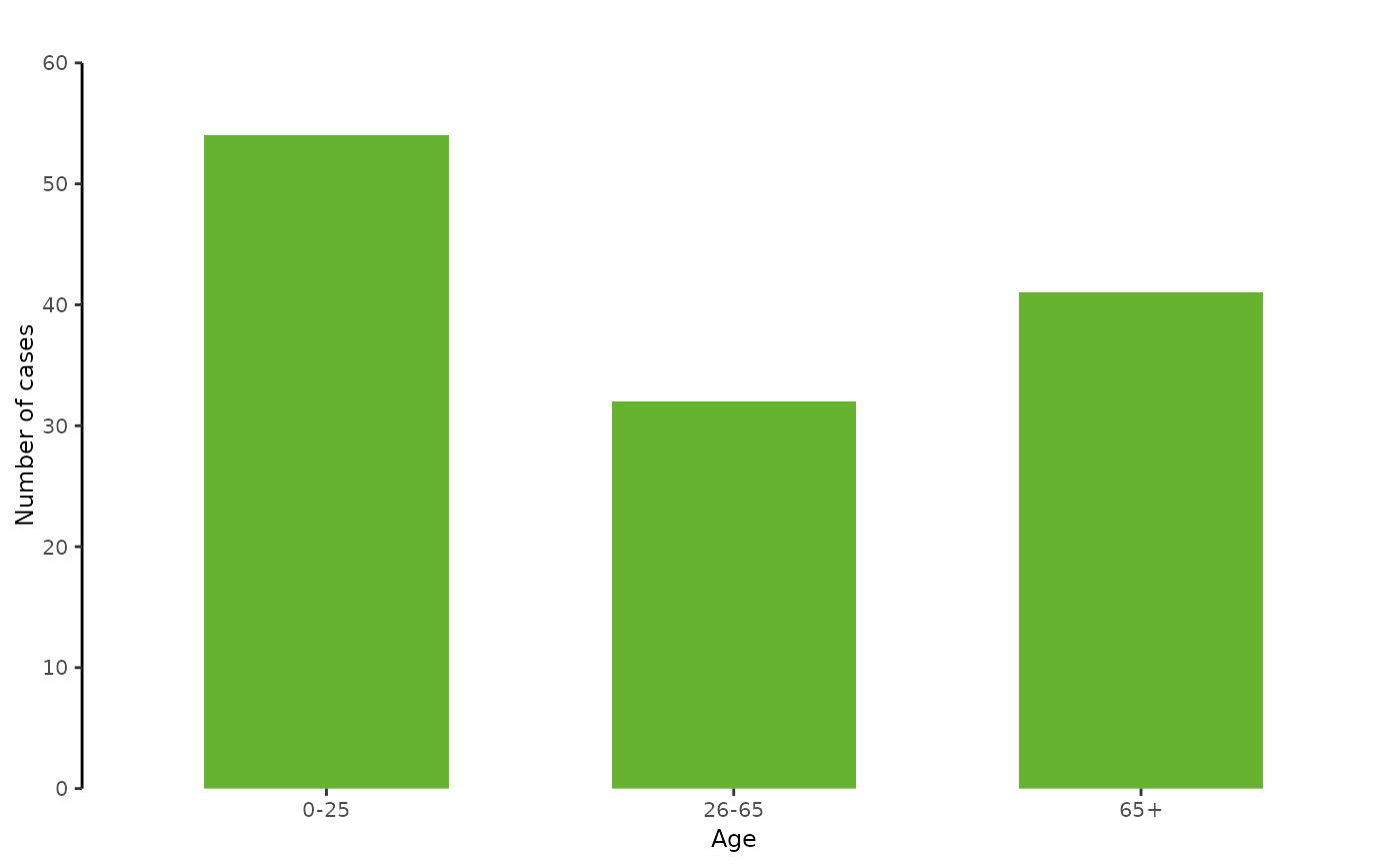
# --- Create dummy data
mydat <- data.frame(AgeGroup = c("0-25", "26-65", "65+"),
                    NumberOfCases = c(54,32,41))

# --- Plot the dummy data
plotBar(mydat,
        xvar = "AgeGroup",
        xlabel = "Age",
        yvar = "NumberOfCases",
        ylabel = "Number of cases")