Horizontal grouped bar graph
plotBarGroupedH.RdThis function draws an horizontal bar graph of the values of variable 'Yvar'
with the categorical variable 'Xvar' on the x-axis.
Expects aggregated data.
Usage
plotBarGroupedH(
  .data,
  xvar = "",
  xlabel = "",
  yvar = "",
  ylabel = "",
  group = "",
  fill_color = EcdcColors(col_scale = "qual", n = length(unique(.data[[group]]))),
  log10_scale = FALSE
)
Arguments
- .data
dataframe containing the variables to plot
- xvar
character string, name of the categorical variable to plot on the x-axis in quotes
- xlabel
character string, label of the x axis
- yvar
character string, name of the numerical variable to plot on the y-axis in quotes
- ylabel
character string, label of the y axis
- group
character string, name of the grouping variable in quotes, e.g. gender.
- fill_color
character string, hexadecimal colour to use in the graph; (default to ECDC green
"#65B32E", seeEcdcColors(col_scale = "qual", n = 1))- log10_scale
boolean, TRUE if y-axis should be log scale (default
FALSE,seeggplot2::scale_y_log10)
See also
Internal function: EcdcColors
Required Packages: ggplot
Examples
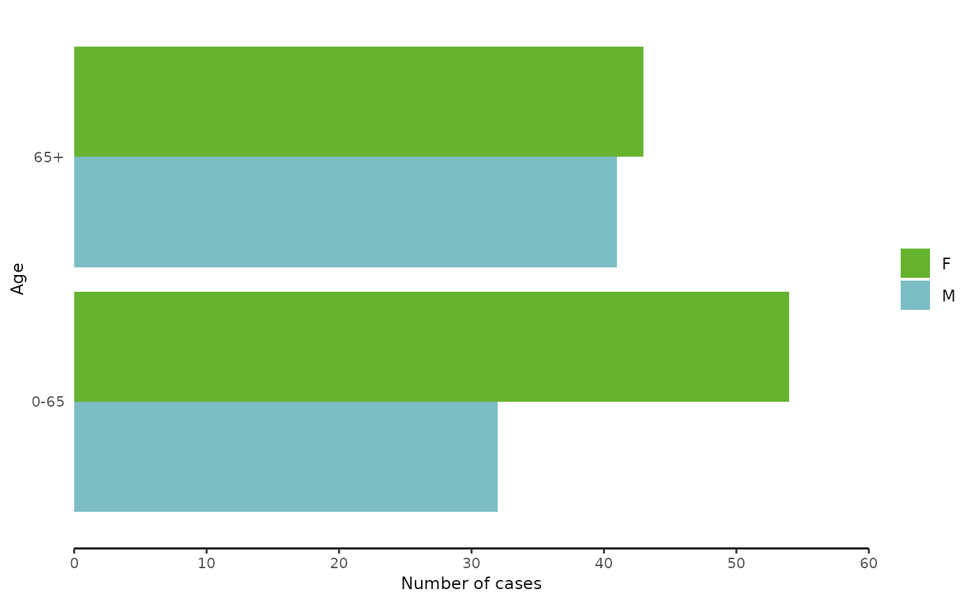
# --- Create dummy data
mydat <- data.frame(Gender=c("F", "F", "M", "M"),
                    AgeGroup = c("0-65", "65+", "0-65", "65+"),
                    NumberOfCases = c(54,43,32,41))

# --- Plot the dummy data
plotBarGroupedH(mydat,
              xvar = "AgeGroup",
              xlabel = "Age",
              yvar = "NumberOfCases",
              ylabel = "Number of cases",
              group = "Gender")