Horizontal bar graph
plotBarH.RdThis function draws an horizontal bar graph of the values of variable 'Yvar'
with the categorical variable 'Xvar' on the x-axis.
Expects aggregated data.
Usage
plotBarH(
  .data,
  xvar = "",
  xlabel = "",
  yvar = "",
  ylabel = "",
  fill_color = EcdcColors(col_scale = "qual", n = 1),
  log10_scale = FALSE,
  xlabel_black = ""
)
Arguments
- .data
dataframe containing the variables to plot
- xvar
character string, name of the categorical variable to plot on the x-axis in quotes
- xlabel
character string, label of the x axis
- yvar
character string, name of the numerical variable to plot on the y-axis in quotes
- ylabel
character string, label of the y axis
- fill_color
character string, hexadecimal colour to use in the graph; (default to ECDC green
"#65B32E", seeEcdcColors(col_scale = "qual", n = 1))- log10_scale
boolean, TRUE if y-axis should be log scale (default
FALSE,seeggplot2::scale_y_log10)- xlabel_black
(optional) character string, value of the categorical variable for which the bar should be black
See also
Internal function: EcdcColors
Required Packages: ggplot
Examples
# --- Create dummy data
mfratio <- data.frame( Country = sample(EpiReport::MSCode$Country, 28),
Ratio = runif(28, min = 0, max = 28))
# --- Plot the dummy data
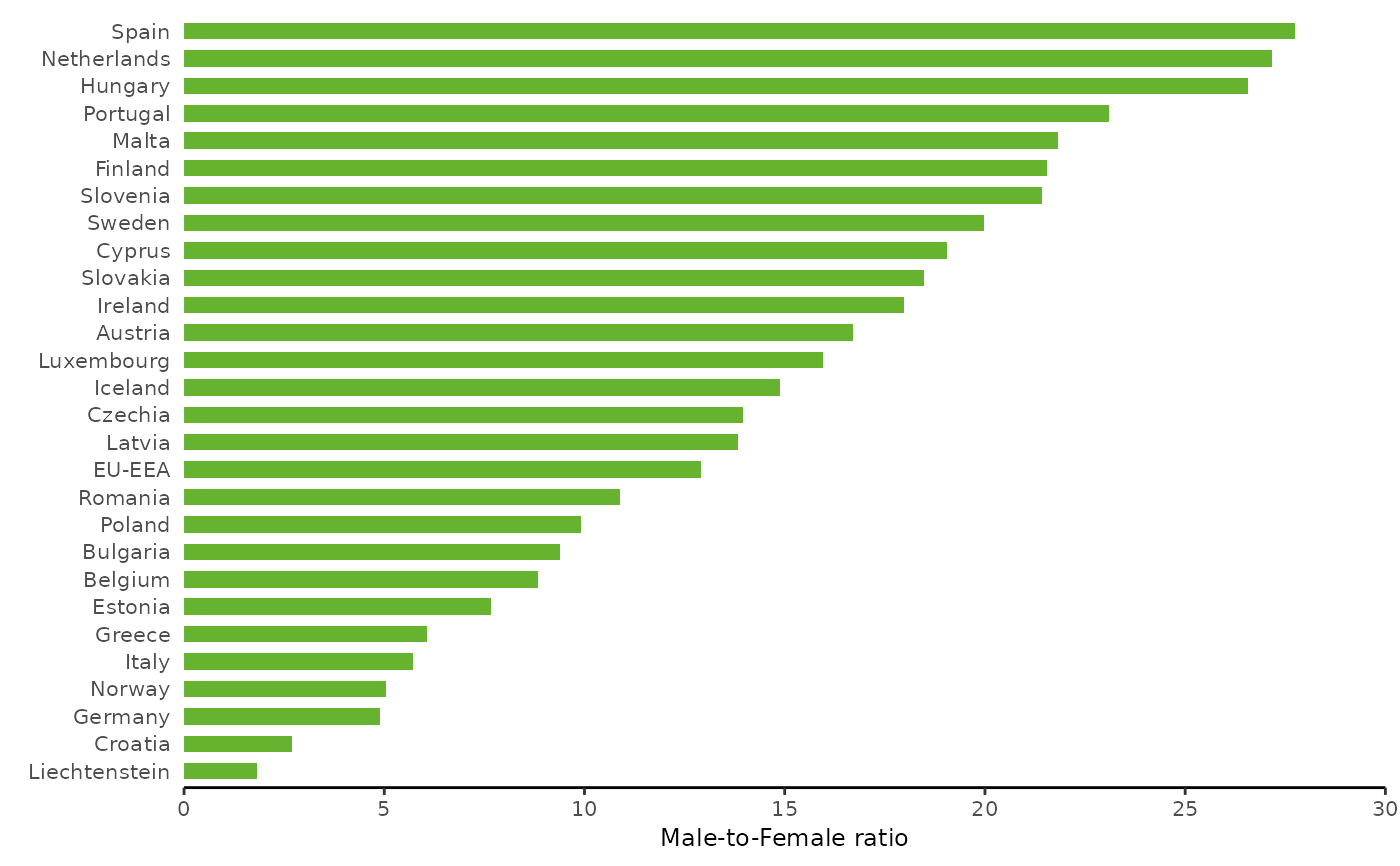
plotBarH(mfratio,
xvar = "Country",
xlabel = "",
yvar = "Ratio",
ylabel = "Male-to-Female ratio",
log10_scale = FALSE)
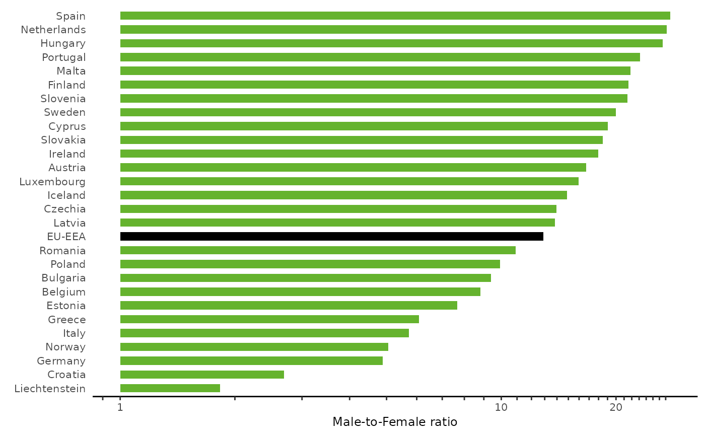
 plotBarH(mfratio,
xvar = "Country",
xlabel = "",
yvar = "Ratio",
ylabel = "Male-to-Female ratio",
log10_scale = TRUE,
xlabel_black = "EU-EEA")
plotBarH(mfratio,
xvar = "Country",
xlabel = "",
yvar = "Ratio",
ylabel = "Male-to-Female ratio",
log10_scale = TRUE,
xlabel_black = "EU-EEA")