Time series plot
plotTS.RdThis function draws a time series of the values of variable 'Yvar'
with the time variable 'Xvar' on the x-axis.
Expects aggregated data.
Usage
plotTS(
  .data,
  xvar = "",
  xlabel = "",
  yvar = "",
  ylabel = "",
  fill_color = EcdcColors(col_scale = "qual", n = 1),
  log10_scale = FALSE,
  xvar_format = "%Y",
  xvar_breaks = "1 year"
)
Arguments
- .data
dataframe containing the variables to plot
- xvar
character string, name of the time variable (expects date format) to plot on the x-axis in quotes
- xlabel
character string, label of the x axis
- yvar
character string, name of the numerical variable to plot on the y-axis in quotes
- ylabel
character string, label of the y axis
- fill_color
character string, hexadecimal colour to use in the graph; (default to ECDC green
"#65B32E", seeEcdcColors(col_scale = "qual", n = 1)- log10_scale
boolean,
TRUEif y-axis should be log scale (defaultFALSE,seeggplot2::scale_y_log10)- xvar_format
character string, time format to use to plot the x-axis (
"%Y"for yearly labels or"%b %Y"for monthly labels)- xvar_breaks
character string, time unit to use to plot the x-axis between breaks (
"1 year"or"1 month", seeggplot2::scale_x_date(date_breaks = ... ))
See also
Internal function: EcdcColors
Required Packages: ggplot
Examples
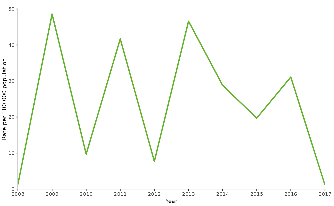
# --- Create dummy data
mydat <- data.frame(TimeCode = seq(as.Date("2008/1/1"), as.Date("2017/1/1"), "years"),
                    YValue = sample(1:500/10, 10))

# --- Plot the dummy data
plotTS(mydat,
       xvar = "TimeCode",
       xlabel = "Year",
       yvar = "YValue",
       ylabel = "Rate per 100 000 population",
       log10_scale = FALSE,
       xvar_format = "%Y",
       xvar_breaks = "1 year")