Base
AnimatedCheck
./src/components/basic/animatedCheck.js
Can be used to feedback a successful action.
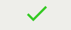
<AnimatedCheck onEnd={() => console.log('animation ended')}/>Props
| Name | Type | Is required | Description | Default value |
|---|---|---|---|---|
| onEnd | func |
AutoAdjustSizeImage
./src/components/basic/autoAdjustSizeImage.js
Image component who will try to use the real size of the source image and keep the ratio.

<AutoAdjustSizeImage src="https://cdn-images-1.medium.com/max/2000/1*dODKUGyGkF8qeGLrXKWkiA.png"/>;Props
| Name | Type | Is required | Description | Default value |
|---|---|---|---|---|
| src | string |
Button
./src/components/basic/button.android.js
A Button with several predefined styles, each serving its own semantic purpose. If a string is provided as children, it will be wrap in a
tag and change to uppercase.
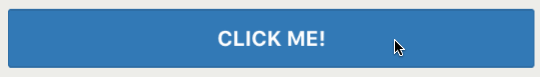
<Button primary onPress={() => console.log('button pressed')}>
    Click me!
</Button>
Props
| Name | Type | Is required | Description | Default value |
|---|---|---|---|---|
| block | bool |
|||
| borderless | bool |
|||
| children | node |
|||
| danger | bool |
|||
| disabled | bool |
|||
| info | bool |
|||
| link | bool |
|||
| onPress | func |
|||
| primary | bool |
|||
| raised | bool |
|||
| style | custom |
|||
| success | bool |
|||
| transparent | bool |
|||
| warning | bool |
Card
./src/components/basic/card/index.js
Props
| Name | Type | Is required | Description | Default value |
|---|---|---|---|---|
| children | node |
|||
| info | string |
|||
| infoPosition | enum('left','center','right') |
|||
| isError | bool |
|||
| onPress | func |
|||
| onPressEdit | func |
|||
| onPressError | func |
|||
| onPressFooter | func |
|||
| style | object |
|||
| title | string |
|||
| titlePosition | enum('left','center','right') |
‘left’ |
CustomCard
./src/components/basic/customCard.js
Props
| Name | Type | Is required | Description | Default value |
|---|---|---|---|---|
| buttons | array |
|||
| dataset | object |
X | ||
| items | array |
|||
| style | custom |
|||
| textAlign | string |
|||
| title | string |
X |
FloatingActionButton
./src/components/basic/fabutton.android.js
A round Button with several predefined styles, each serving its own semantic purpose. No text of children can be passed, it used the prop “name” to display an icon. https://material.io/icons/

<FloatingActionButton onPress={() => console.log('button pressed')} name="attachment"/>Props
| Name | Type | Is required | Description | Default value |
|---|---|---|---|---|
| block | bool |
|||
| borderless | bool |
|||
| danger | bool |
|||
| info | bool |
|||
| link | bool |
|||
| name | string |
|||
| onPress | func |
|||
| primary | bool |
|||
| raised | bool |
|||
| style | custom |
|||
| success | bool |
|||
| transparent | bool |
|||
| warning | bool |
Footer
./src/components/basic/footer.js
__Deprecated__
Props
| Name | Type | Is required | Description | Default value |
|---|---|---|---|---|
| children | node |
|||
| style | custom |
Group
./src/components/basic/group.js
A collapsible container with several predefined styles, each serving its own semantic purpose (highest level to the lowest).
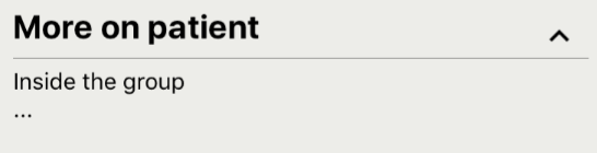
<Group title="More on patient" collapsible>
    <Text>Inside the group</Text>
    <Text>...</Text>
</Group>
Props
| Name | Type | Is required | Description | Default value |
|---|---|---|---|---|
| children | node |
|||
| collapsible | bool |
false | ||
| defaultCollapsed | bool |
false | ||
| title | string |
|||
| titleContainer | object |
style for the title view | ||
| transparent | bool |
false | ||
| type | enum('primary','second','third','fourth') |
‘primary’ |
ProgressSwipeRow
./src/components/basic/swipe/index.js
A View component that swipe open and closed.

<ProgressSwipeRow
    leftChildren={
        <TouchableOpacity onPress={() => console.log('send clicked')}>
            <View style={{padding: 10}}>
                <Icon color="#FFF" name="send" size={24}/>
            </View>
        </TouchableOpacity>
    }
    rightChildren={
        <TouchableOpacity onPress={() => console.log('Delete clicked')}>
            <View style={{padding: 10}}>
                <Icon color="#FFF" name="delete" size={24}/>
            </View>
        </TouchableOpacity>
    }
    >
    <AutoAdjustSizeImage src="https://cdn-images-1.medium.com/max/2000/1*dODKUGyGkF8qeGLrXKWkiA.png"/>
</ProgressSwipeRow>
Props
| Name | Type | Is required | Description | Default value |
|---|---|---|---|---|
| children | element |
|||
| leftBackgroundColor | string |
‘#5CB85C’ | ||
| leftChildren | element |
|||
| maxOffset | number |
75 | ||
| rightBackgroundColor | string |
‘#D9534F’ | ||
| rightChildren | element |
Tab
./src/components/basic/tab/tab.js
Navigation item used with the other one “Tabs”. It will first render an ActivityIndicator (loading) until all its children are rendered. That way the device won’t be slow down if there is a lot of things to render.
<Tabs wide>
    <Tab tabLabel="Tab 1">
        <Text>Content tab1</Text>
    </Tab>
    <Tab tabLabel="Tab 2">
        <Text>Content tab2</Text>
    </Tab>
</Tabs>
Props
| Name | Type | Is required | Description | Default value |
|---|---|---|---|---|
| children | node |
|||
| tabLabel | string |
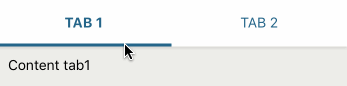
Tabs
./src/components/basic/tab/tabs.js
Navigation item to generate a tabbed interface.
<Tabs wide>
    <Tab tabLabel="Tab 1">
        <Text>Content tab1</Text>
    </Tab>
    <Tab tabLabel="Tab 2">
        <Text>Content tab2</Text>
    </Tab>
</Tabs>
Props
| Name | Type | Is required | Description | Default value |
|---|---|---|---|---|
| children | node |
|||
| wide | bool |
use it if intend for a full-page tabs | false |
TouchableWithData
./src/components/basic/touchableWithData.js
Touchable item who return passed datas to the callback. Usefull when iterate on an array.
const handleClick = oDataset => {
    const {id, name} = oDataset;
    console.log(id, name);
};

{
    aPatients.map((oPatientData, iIndex) => {
        return (
            <TouchableWithData
                data-id={oPatientData.id}
                data-name={oPatientData.name}
                onPress={handleClick}
                >
                <Text>{oPatientData.name}</Text>
            </TouchableWithData>
        );
    })
}
Props
| Name | Type | Is required | Description | Default value |
|---|---|---|---|---|
| children | node |
|||
| onPress | func |
|||
| style | custom |